Hey , you !


  • Home

  • Archives

Browsers Disabled Audio AutoPlay

Posted on 2018-11-26 | In js

If you have used audio or video, I guess you probably know autoplay attribute. Sometimes, PM wants to use that. However, the browsers doesn’t want that.

When I was using autoplay on 2018.10, I find that safari and chrome disabled autoplay when user haven’t interacted with the page, especially on safari mobile. It’s annoying.

So, if you want to use autoplay it may fail. So, some guys choose to play the audio when user click or touch the page. But I think the better way is to detect whether the user’s browser support autoplay. And the way is:

audioEl
.play()
.then(res => {
//not disabled
})
.catch(er => {
//disabled
})

However, ie11 and edge before 2018.1 returns undefined when audio.play(). So, if you care about that, you may try:

let audioState = audioEl.play()
if (typeof audioState !== 'undefined') {
audioState
.then(res => {
//not disabled
})
.catch(er => {
//disabled
})
}
//other logic? what are you gonna do?

Original Post

Reference

  • Autoplay Best Practices with Video.js

Chrome, vh Is Always Calculated as If the Url Bar Is Hidden

Posted on 2018-11-25 | In css

The first time when I know vh I was very excited. Finally, we can do this by css instead of js. However, still too naive.

As we all know, scroll bar would hide automatically on mobile. So, it wouldn’t affect the layout like on desktop.

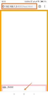
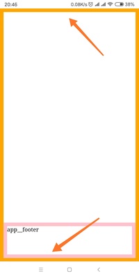
However, the address bar would also hide when scrolling. Like images below:

And the code is:

<!DOCTYPE html>
<html lang="en">
<head>
<meta charset="UTF-8" />
<meta name="viewport" content="width=device-width, initial-scale=1.0" />
<meta http-equiv="X-UA-Compatible" content="ie=edge" />
<title>Document</title>
<style>
* {
margin: 0;
padding: 0;
}

html,
body,
.app {
/* height: 100%; */
height: 100vh;
}

.app {
width: 100%;
border: 10px solid orange;
box-sizing: border-box;
position: relative;
}

.app__footer {
height: 100px;
width: 100%;
box-sizing: border-box;
border: 10px solid pink;
position: absolute;
bottom: 0;
}
</style>
</head>

<body>
<div id="app" class="app">
<header class="app__header"></header>
<main class="app__main"></main>
<footer class="app__footer">app__footer</footer>
</div>
</body>
</html>

The viewport size changes when scrolling. In my Mi6X, the smaller is 659px while the larger one is 715px when the address bar is hidden.

According to test on chrome 70, height:100% and window.innerHeight is always equal to the smaller one. I think it is correct. I also thought 100vh would act like 100%. However, it’s not.

According to developers.google the vh is always calculated as if the URL bar is hidden since Chrome version 56.

So, 100vh is equal to the larger one which is 715px on my phone. That’s why images above would happen. In this case, if we use something like bottom:0; with 100vh we would meet situation like image one. Part of app__footer was covered. Instead, if we use height:100%, it won’t happen.

However, as we all know it wouldn’t be possible to use 100% when we were in nested css modules. So, in this case, how can we get the 100% in nested css modules?

Of course, we can save the 100% to rem like:

document.documentElement.style.fontSize = window.innerHeight * 0.01 + 'px'

But I think the better way is using CSS_variables. For example:

html,
body,
.app {
/* height: 100%; */
/* height: 100vh; */
height: calc(var(--vh) * 100);
}
document.documentElement.style.setProperty(
'--vh',
window.innerHeight * 0.01 + 'px'
)

Also, if you are worried about the compatibility. Here is the polyfill.

Original Post

Reference

  • the-trick-to-viewport-units-on-mobile
  • CSS3 100vh not constant in mobile browser

Image Load Error Handler

Posted on 2018-11-19 | In js

Preface

In the past, I posted an answer in SO about how to replace broken images. And the code is

window.addEventListener(
'error',
windowErrorCb,
{
capture: true
},
true
)

function windowErrorCb(event) {
let target = event.target
let isImg = target.tagName.toLowerCase() === 'img'
if (isImg) {
imgErrorCb()
return
}

function imgErrorCb() {
let isImgErrorHandled = target.hasAttribute('data-src-error')
if (!isImgErrorHandled) {
target.setAttribute('data-src-error', 'handled')
target.src = 'backup.png'
} else {
//anything you want to do
console.log(target.alt, 'both origin and backup image fail to load!')
}
}
}

And the point is :

  1. Put the code in the head and executed as the first inline script. So, it will listen the errors happen after the script.

  2. Use event capturing to catch the errors earlier, also for those events which don’t bubble.

  3. Use event delegation which avoids binding events on each image.

  4. Give the error img element an attribute after giving them a backup.png to avoid error of the backup.png and subsequent infinite loop like below:

img error->backup.png->error->backup.png->error->,,,,,

I thought the answer is almost perfect. But it turns out there is more scenes I don’t know.

No Src?

Until Chrome 70.0.3538.102 in win7, code below wouldn’t trigger error event.

<img />

But code below would trigger!

<img src="" /> <img src />

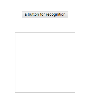
That does make sense. However, img without src wouldn’t hidden. They would have 1px border like:

In this case, we may have to do something about that. For instance,

img:not([src]) {
opacity: 0;
}

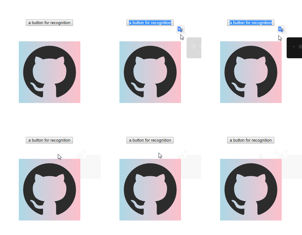
or a default backgroundImage which will work on img though 1px border is still there.

img:not([src]) {
background: no-repeat left top / cover;
background-image: linear-gradient(to right, lightblue, pink); /*or your logo*/
}

BackgroundImage Error?

I still can’t find a perfect solution for backgroundImage. The best answer in SO is like:

.app__bg_img_box {
background: no-repeat left top / cover;
background-image: url(./images/github.png), linear-gradient(to right, lightblue, pink);
/* you can also use default.png like code below */
/* background-image: url(./images/github.png), url(./images/default.png); */
}

And the cons is obvious.

  1. You have to take care of the transparency problem of the target image.
  2. Users can see the toggle between target image and default image.
  3. A little flaw is that default image will always be downloaded.

Another way I figured out is like code below. Here is the simplest code:

let backgroundDivs = Array.from(document.querySelectorAll('.app__bg_img_box'))
backgroundDivs.forEach(div => {
let imgUrl = window
.getComputedStyle(div)
.backgroundImage.match(/url\(["']?(.*)["']?\)/)
if (imgUrl) {
let img = new Image()
img.src = imgUrl[1]
img.onerror = function(event) {
div.style.backgroundImage = 'url(./images/default.png)'
img.onerror = null
}
}
})

It will work well in most simple scenes but the cons is also obvious:

  1. Code will be more complicated if you want to deal with multiple backgroundImages.
  2. Each time you updated your dom structure, you may have to run the code above if you have add new divs with backgroundImage.

Ending

If lucky enough, we may have the new API in Images which would make code below work.

background: image('target.gif', 'fallback.gif');

Reference

  • onerror event using background: url()

  • image-set-notation

1…789…18

xianshenglu

54 posts
14 categories
142 tags
© 2023 xianshenglu
Powered by Hexo
|
Theme — NexT.Muse v5.1.4