Hey , you !


  • Home

  • Archives

Web Performance Optimization Summary in 2019.3

Posted on 2019-03-25 | In Web Performance Optimization

Where to Learn Web Performance Optimization(WPO)

About one month ago, I started to learn and summarize the knowledge about web performance optimization. However, beyond my expectations, there is too many things need to know. After thinking, I chose developers.google.com to start to learn. And other resources are listed here with this article.

The reasons that I chose developers.google.com can be listed below:

  • Articles will update when some methods or workarounds is outdated. This is extremely important for me to check it out when I need to update my knowledge about WPO. Also, it lets me know that I am learning something which can be tested and applied right now. For me, a blog is not better than a real-time updated document.
  • All the knowledge about WPO was listed systematically which is easy to understand, remember and use.

Summary About WPO

There are too many things for me to remember or test according to the doc. So, I am trying to summarize and abstract to make it simple to deduce and remember. Well, let’s start with the questions.

What Is the Target of WPO

To make the page load as quickly as possible, also in a progressive way if possible.

How Can We Do That

Generally, we can analyze from the following aspects.

  • Use as much cache as possible.

    • For a better control of cache in the front end, we may need to learn something about PWA or Service Worker.
    • Or we might need some knowledge about offline storage like Indexed DB, Web SQL, localStorage and so on.
  • For those content that we can’t use the cache, we need to take other measures.

    • Send as little content as possible which

      • needs code compression, GZIP, code split, tree shake, image compression and remove or replace the bigger resources with smaller ones if possible.

      • refactor component, export, import and file structure with code split or routes.

    • Send the content as closely as possible which

      • needs the help of CDN.
    • Send the content simultaneously as many as possible which

      • needs the help of http/2.0 to breakthrough the 6 parallel TCP connections limit in http/1.1 and request the resources simultaneously instead of one by one.
    • Load the resource in a more efficient way which

      • needs to put script at the bottom of body

      • use the async or defer according to the situation

      • use prefetch, preconnect or dns-prefetch according to the situation

  • Render the page in a more efficient way which requires more efficient practice in our daily code. For examples,

    • Use requestAnimationFrame to change the UI instead of setTimeout or setInterval.

    • Implement lazy load with Intersection Observer instead of calculating the position of each target element by getBoundingClientRect.

    • Stick to compositor-only properties like transform and opacity to avoid re-layout and re-paint.

    • Reduce the complexity of selectors.

    • ….

How Can We Prove That Our Optimization Is Work

We need some tools like below to collect the result each time we did an optimization.

  • Lighthouse
  • WebPageTest
  • PageSpeed Insights
  • ……

Strictly

Strictly speaking, if we want to do WPO seriously for a long time, we still need to do something like:

  • Set a performance budget
  • Use performance or google analysis tool to get the performance data in the real scene.
  • …

Last Words

Here is just a summary about WPO. More accurate information is in developers.google.com.
Source

Reference

Notes for Developing Web Page

Posted on 2019-02-01 | In summary

Here is the stuff.

Still Consider IE?

If you still need to be compatible with IE browser, the below tag might be needed to render page using EdgeHTML instead of uncertain render engine.

<meta http-equiv="X-UA-Compatible" content="IE=edge" />

Use Custom Font on the Web?

fontmin will help you. For more information, check issues/72.

Consider Scroll Bar

Before we can directly set scroll bar width by ::-webkit-scrollbar for major browsers on PC, we always need to take care of the toggle of scroll bar because it might affect the layout except in Mac. For example,

  • It is common that we need to use box-sizing: border-box; to include the scroll bar.
  • Sometimes we even need to get the scroll bar width in js.

Anyway, make sure that you have already considered scroll bar before production. For example, the style, the effect of layout, etc.

Mobile Web Page

For the mobile web page, we need to do something else and I write a summary here.

Source

Reference

Notes for Developing Mobile Web Page

Posted on 2019-01-28 | In summary

Layout

I guess most of you were using rem, vw, viewport etc.

For rem or vw, we always work with the below tag.

<meta name="viewport" content="width=device-width, initial-scale=1.0" />

And then we transformed px to rem or vw by plugins. However, some guys prefer using internal scale logic like below:

<!-- if the device-width is 375 -->
<meta name="viewport" content="width=750, initial-scale=0.5" />

It will also work by changing the width and initial-scale at the same time.

However, in most cases, we can see the meta[name="viewport"] with more complicated content. For example,

<meta
name="viewport"
content="width=device-width, initial-scale=1.0, minimum-scale=1, maximum-scale=1, user-scalable=no"
/>

What if we remove the minimum-scale, minimum-scale and user-scalable? The result is:

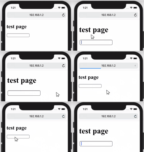
  • If an input was focused on safari, the web page would zoom in. Here is the proof.

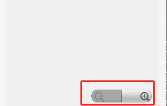
  • You will get the scale buttons like below when you touch the page in WeChat 7.0.0, at least in Android.

And the solution is to add user-scalable=no or minimum-scale=1, minimum-scale=1. But you have to accept a shortcoming:

  • User can’t zoom the page using two fingers, at least in my Android WeChat and Chrome 71. Though in some browsers user can still zoom like UC, QQ etc.

For better compatibility, we may have to use both user-scalable=no and minimum-scale=1, minimum-scale=1. That’s why we always see the code below.

<meta
name="viewport"
content="width=device-width, initial-scale=1.0, minimum-scale=1, maximum-scale=1, user-scalable=no"
/>

Screen With High Resolution

Normally, we would use png@2x, png@3x etc to solve the vague problem of images brought by high resolution screen. For example,

@media (-webkit-min-device-pixel-ratio: 2), (min-resolution: 192dpi) {
.example {
background: url('/images/my_image@2x.png') center center no-repeat;
background-size: cover;
}
}
@media (-webkit-min-device-pixel-ratio: 3), (min-resolution: 288dpi) {
.example {
background: url('/images/my_image@3x.png') center center no-repeat;
background-size: cover;
}
}

A convenient way to do this is by retinajs. And for icons, I would suggest you use svg if possible.

vh Is Always Calculated as If the Url Bar Is Hidden.

In brief, 100vh doesn’t equal window.innerHeight. For more, check issues/38.

Consider the Pop-Up Keyboard

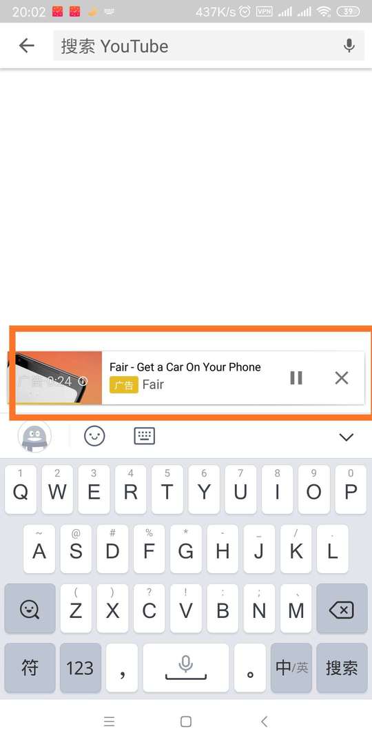
If there is an input or another form element, the keyboard would pop up when the element was focused. For example,

Is this a bug? Maybe… At least, you have to notice that before deploying. And the best way I think is to consult PM or designer if it’s okay.

In that case, the keyboard would make vh smaller which may ruin the layout using vh.

Link Highlight While It’s Being Tapped

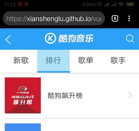
In my Android Chrome 71, the highlight would show when I touch the link.

We can disable it by the code below.

a {
-webkit-tap-highlight-color: rgba(0, 0, 0, 0);
-webkit-tap-highlight-color: transparent; /* For some Androids */
}

I would suggest you disable it because different manufacturers may show different colors.

img Without src Would Have 1px White border on Mobile Chrome 70.

You may need to add the code below to your reset.css to hide the img without src.

img:not([src]) {
opacity: 0;
}

Qrcode in WeChat

  • Use img Instead of background-image. Otherwise, it won’t work.
  • Don’t put two qrcodes in one screen. Otherwise, it would only recognize one.

Format-detection

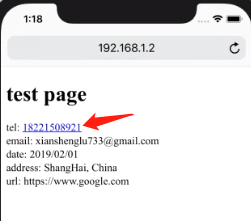
It is said that iOS safari has a default style for telephone numbers, email, etc. As I tested in iPhoneX 11.3, at least for telephone numbers, it does have a default style like below.

If we want to disable the default style we can use the code below to avoid that.

<meta
name="format-detection"
content="telephone=no, email=no, date=no, address=no, url=no"
/>

If you want to call telephone, send message etc when the element is clicked you can do it by

<a href="tel:020-11811922">Call me: 020-11811922</a>
<a href="sms:10086">Send me a message: 10086</a>

Disable Select

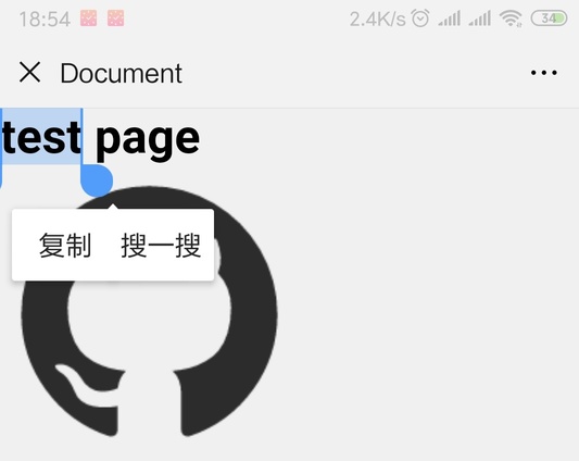
You may want to avoid the situation like below when the user is touching the text of the element.

You can use the code below to avoid that.

.example {
-webkit-user-select: none;
-moz-user-select: none;
-ms-user-select: none;
user-select: none;
}

The user may still hear the tone or feel the vibration, at least in my WeChat 7.0.0. However, the user can still trigger selection on UC, QQ browser with an extra operation.

Avoid Popup Menu in Long Touch ?(Not Compatible)

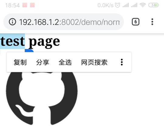
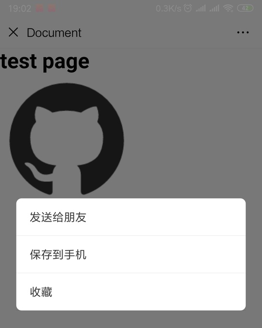
You may also want to disable popup like below when the user is touching an image or other stuff

In this case, user-select:none is not enough to cover this. You may have to add js code like below.

window.addEventListener('contextmenu', event => event.preventDefault())

Our User may still hear the tone or feel the vibration, at least in my Android Chrome 71. However, in WeChat, QQ and UC browser, it doesn’t work.

and CSS to disable callout in iOS.

.target {
-webkit-touch-callout: none;
}

Use touchstart to Imitate hover

As we all know, there is no hover on mobile. If you really want that, you can use touchstart to imitate it.

No Need to Worry About the Scroll Bar

On mobile, the scroll bar would hide automatically when you stop scrolling.

Source

Reference

  • user-scalable
1…456…18

xianshenglu

54 posts
14 categories
142 tags
© 2023 xianshenglu
Powered by Hexo
|
Theme — NexT.Muse v5.1.4