Layout
I guess most of you were using rem, vw, viewport etc.
For rem or vw, we always work with the below tag.
<meta name="viewport" content="width=device-width, initial-scale=1.0" /> |
And then we transformed px to rem or vw by plugins. However, some guys prefer using internal scale logic like below:
<!-- if the device-width is 375 --> |
It will also work by changing the width and initial-scale at the same time.
However, in most cases, we can see the meta[name="viewport"] with more complicated content. For example,
<meta |
What if we remove the minimum-scale, minimum-scale and user-scalable? The result is:
If an
inputwas focused on safari, the web page would zoom in. Here is the proof.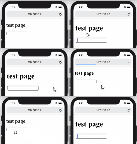
You will get the scale buttons like below when you touch the page in WeChat 7.0.0, at least in Android.
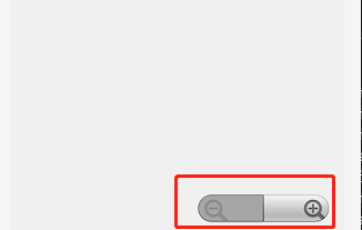
And the solution is to add user-scalable=no or minimum-scale=1, minimum-scale=1. But you have to accept a shortcoming:
- User can’t zoom the page using two fingers, at least in my Android WeChat and Chrome 71. Though in some browsers user can still zoom like UC, QQ etc.
For better compatibility, we may have to use both user-scalable=no and minimum-scale=1, minimum-scale=1. That’s why we always see the code below.
<meta |
Screen With High Resolution
Normally, we would use png@2x, png@3x etc to solve the vague problem of images brought by high resolution screen. For example,
@media (-webkit-min-device-pixel-ratio: 2), (min-resolution: 192dpi) { |
A convenient way to do this is by retinajs. And for icons, I would suggest you use svg if possible.
vh Is Always Calculated as If the Url Bar Is Hidden.
In brief, 100vh doesn’t equal window.innerHeight. For more, check issues/38.
Consider the Pop-Up Keyboard
If there is an input or another form element, the keyboard would pop up when the element was focused. For example,
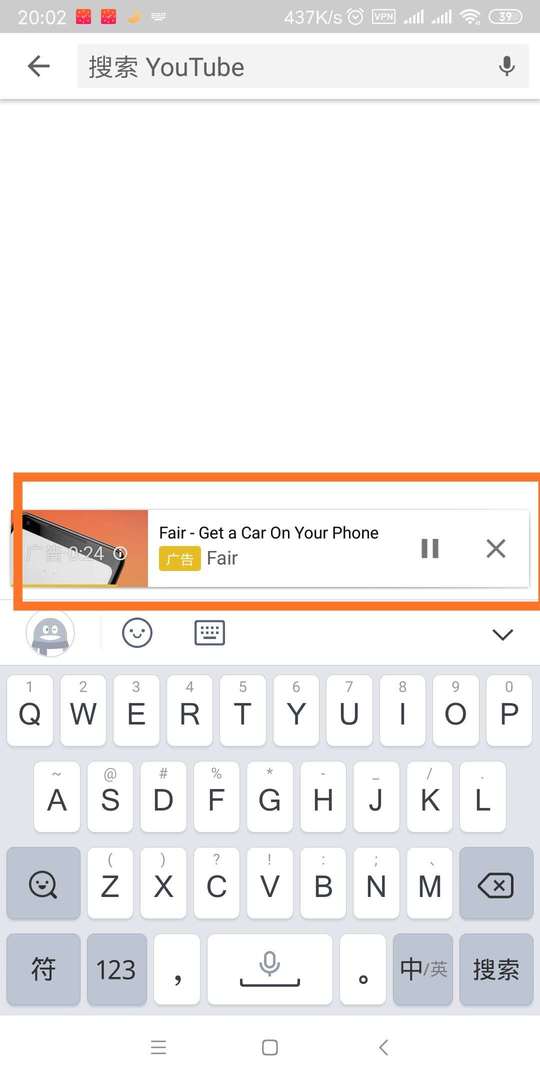
Is this a bug? Maybe… At least, you have to notice that before deploying. And the best way I think is to consult PM or designer if it’s okay.
In that case, the keyboard would make vh smaller which may ruin the layout using vh.
Link Highlight While It’s Being Tapped
In my Android Chrome 71, the highlight would show when I touch the link.

We can disable it by the code below.
a { |
I would suggest you disable it because different manufacturers may show different colors.
img Without src Would Have 1px White border on Mobile Chrome 70.
You may need to add the code below to your reset.css to hide the img without src.
img:not([src]) { |
Qrcode in WeChat
- Use
imgInstead ofbackground-image. Otherwise, it won’t work. - Don’t put two qrcodes in one screen. Otherwise, it would only recognize one.
Format-detection
It is said that iOS safari has a default style for telephone numbers, email, etc. As I tested in iPhoneX 11.3, at least for telephone numbers, it does have a default style like below.
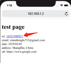
If we want to disable the default style we can use the code below to avoid that.
<meta |
If you want to call telephone, send message etc when the element is clicked you can do it by
<a href="tel:020-11811922">Call me: 020-11811922</a> |
Disable Select
You may want to avoid the situation like below when the user is touching the text of the element.
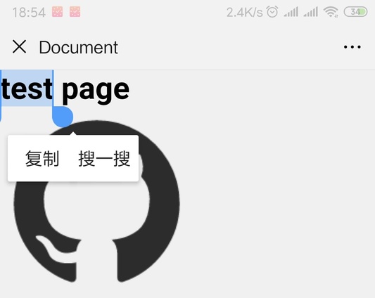
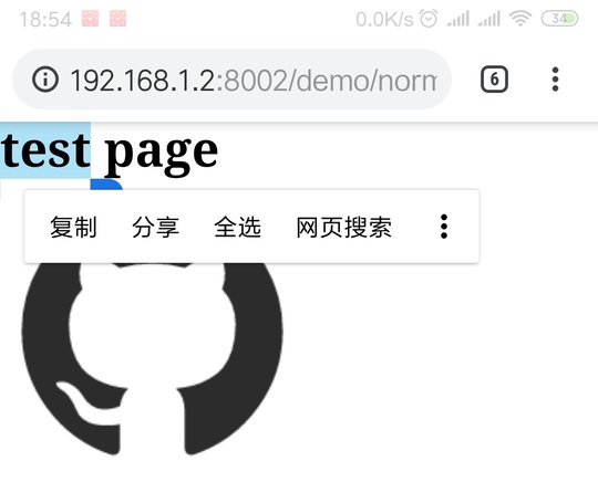
You can use the code below to avoid that.
.example { |
The user may still hear the tone or feel the vibration, at least in my WeChat 7.0.0. However, the user can still trigger selection on UC, QQ browser with an extra operation.
Avoid Popup Menu in Long Touch ?(Not Compatible)
You may also want to disable popup like below when the user is touching an image or other stuff
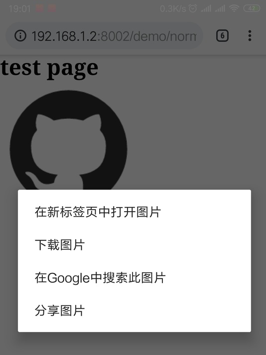
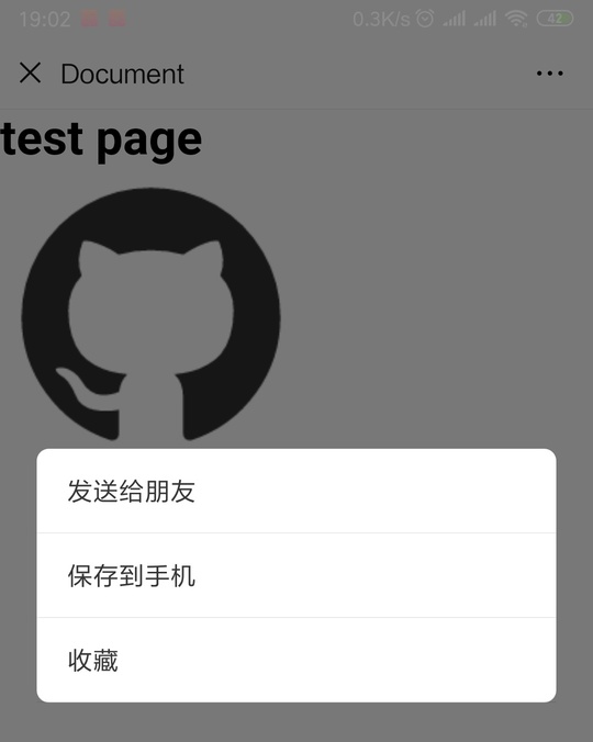
In this case, user-select:none is not enough to cover this. You may have to add js code like below.
window.addEventListener('contextmenu', event => event.preventDefault()) |
Our User may still hear the tone or feel the vibration, at least in my Android Chrome 71. However, in WeChat, QQ and UC browser, it doesn’t work.
and CSS to disable callout in iOS.
.target { |
Use touchstart to Imitate hover
As we all know, there is no hover on mobile. If you really want that, you can use touchstart to imitate it.
No Need to Worry About the Scroll Bar
On mobile, the scroll bar would hide automatically when you stop scrolling.