The first time when I know vh I was very excited. Finally, we can do this by css instead of js. However, still too naive.
As we all know, scroll bar would hide automatically on mobile. So, it wouldn’t affect the layout like on desktop.
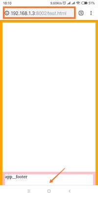
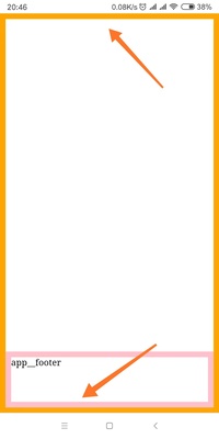
However, the address bar would also hide when scrolling. Like images below:


And the code is:
|
The viewport size changes when scrolling. In my Mi6X, the smaller is 659px while the larger one is 715px when the address bar is hidden.
According to test on chrome 70, height:100% and window.innerHeight is always equal to the smaller one. I think it is correct. I also thought 100vh would act like 100%. However, it’s not.
According to developers.google the vh is always calculated as if the URL bar is hidden since Chrome version 56.
So, 100vh is equal to the larger one which is 715px on my phone. That’s why images above would happen. In this case, if we use something like bottom:0; with 100vh we would meet situation like image one. Part of app__footer was covered. Instead, if we use height:100%, it won’t happen.
However, as we all know it wouldn’t be possible to use 100% when we were in nested css modules. So, in this case, how can we get the 100% in nested css modules?
Of course, we can save the 100% to rem like:
document.documentElement.style.fontSize = window.innerHeight * 0.01 + 'px' |
But I think the better way is using CSS_variables. For example:
html, |
document.documentElement.style.setProperty( |
Also, if you are worried about the compatibility. Here is the polyfill.