Build Multiple Choice Cascader with Third Party ui

Preface

I need to make a cascader which can support multiple choices. However, I didn’t find any ui which supports that until 2018.11.18. That was a little pity.

Main

I check the element-ui and find multiple cascader was in toDoList while ant-design refuse to support that directly. Maybe because they have already implemented TreeSelect. Here is what TreeSelect looks like:
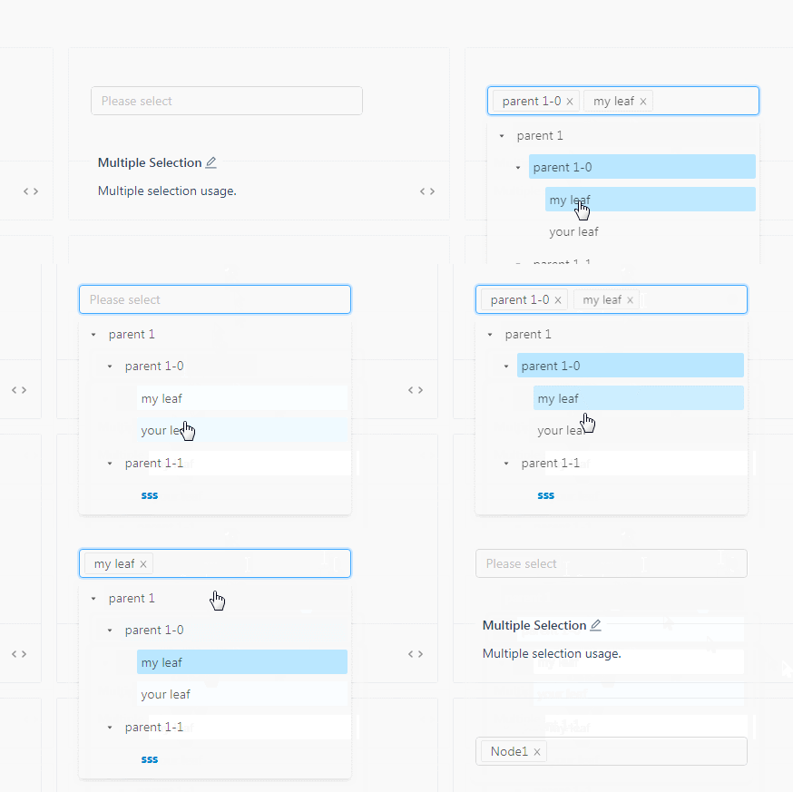
Almost the result I want except the ui. It doesn’t look like a cascader but a tree.

Anyway, I built a multiple cascader component based on select and cascader in ant-design-vue. Here is the result:
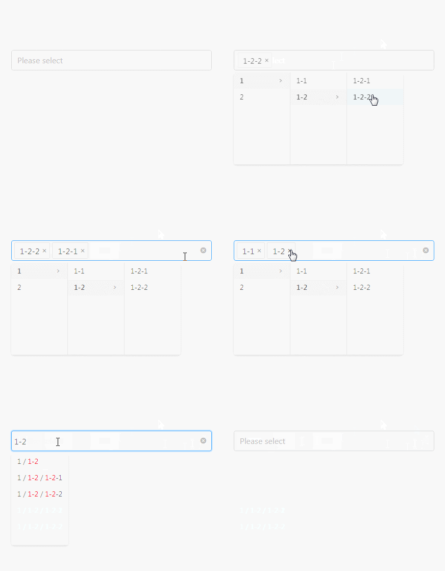
The principle is easy. I use the input in select and hide the popup. And then I hide the input in cascader and show the popup. So, MultipleCascader is equal to input in select plus popup in cascader and use transform to let them stay together.

Talking about the event, you have to listen and change the data to show correctly. That is a little troublesome.

Anyway, here is the earliest demo in codesandbox. I am not sure if the demo would be always able to visit.

The latest version is in here.
So, here is the earliest code:

App.vue

<template>
<div id="app" class="app"><MultipleCascader /></div>
</template>

<script>
import MultipleCascader from "./components/MultipleCascader";
export default {
name: "app",
components: {
MultipleCascader
}
};
</script>

<style scoped></style>

MultipleCascader.vue

<template>
<div class="multi_cascader">
<a-cascader
size="large"
class="multi_cascader__cascader"
:popupVisible="cascaderPopupVisible"
:popupClassName="'multi_cascader__cascader_popup' + timestamp"
changeOnSelect
expandTrigger="hover"
:options="cascaderOptions"
:fieldNames="{ label: 'label', value: 'id', children: 'children' }"
v-model="cascaderValues"
ref="cascader"
:showSearch="{ cascaderFilter }"
@change="cascaderChange"
></a-cascader>
<a-select
size="large"
class="multi_cascader__select"
dropdownClassName="hide"
mode="multiple"
:value="selectValues"
allowClear
placeholder="Please select"
:options="selectOptions"
@focus="cascaderPopupVisible = true"
@deselect="deleteOption"
@change="selectChange"
@search="selectSearch"
></a-select>
</div>
</template>

<script>
export default {
name: "MultipleCascader",
data: function() {
return {
timestamp: Date.now(),
selectOptions: [],
selectValues: [],
cascaderPopupVisible: false,
cascaderValues: [],
cascaderOptions: [
{
id: 1,
value: "1",
label: "1",
children: [
{ id: 1.1, value: 1.1, label: "1-1" },
{
id: 1.2,
value: 1.2,
label: "1-2",
children: [
{ id: 1.21, value: 1.21, label: "1-2-1" },
{ id: 1.22, value: 1.22, label: "1-2-2" }
]
}
]
},
{ id: 2, value: 2, label: "2" }
]
};
},
mounted() {
document.addEventListener("click", this.hideCascaderPopup);
},
destroyed() {
document.removeEventListener("click", this.hideCascaderPopup);
},
methods: {
cascaderChange(values, options) {
// you may have different logic with the selected option, here I just want the last one.
let targetValue = values.slice(-1).pop();
let targetOption = options.slice(-1).pop();
let selectedValIndex = this.selectValues.indexOf(targetValue);
if (selectedValIndex >= 0) {
this.selectValues.splice(selectedValIndex, 1);
this.selectOptions.splice(selectedValIndex, 1);
} else {
this.selectValues.push(targetValue);
this.selectOptions.push(targetOption);
}
},
deleteOption(value) {
let selectedValIndex = this.selectValues.indexOf(value);
this.cascaderChange([value], [this.selectOptions[selectedValIndex]]);
},
selectChange(values, vNodes) {
if (values.length === 0) {
this.selectValues = [];
this.selectOptions = [];
}
},
selectSearch(keyword) {
let searchInput = this.$refs.cascader.$el.querySelector("input");
if (searchInput) {
searchInput.value = keyword;
searchInput.dispatchEvent(new Event("input"));
}
},
cascaderFilter(inputValue, path) {
return path.some(
option =>
option.label.toLowerCase().indexOf(inputValue.toLowerCase()) > -1
);
},
hideCascaderPopup(event) {
let cascaderPopup = document.querySelector(
".multi_cascader__cascader_popup" + this.timestamp
);
let isClickCascaderPopup =
cascaderPopup && cascaderPopup.contains(event.target);
if (isClickCascaderPopup) {
return;
}
this.cascaderPopupVisible = false;
}
}
};
</script>

<style scoped>
.multi_cascader {
height: 100vh;
display: flex;
flex-flow: column;
justify-content: center;
align-items: center;
}
.multi_cascader__select {
width: 50%;
margin-top: 0;
margin-bottom: auto;
transform: translate(0, -100%);
}
.multi_cascader__cascader {
width: 50%;
margin-top: auto;
margin-bottom: 0;
opacity: 0;
}
</style>

<style>
/* global style*/
.hide {
display: none;
}
</style>

Ending

Reference