Preface
Based on first-exploration-on-mobile we can develop adaptive pages on mobile. Now, let’s do it.
Main
Basic Code
Suppose that we got the PSD which is designed according to iPhone6. So, what do we have now?
- width:375*667
- DPR:2
So, let’s develop according to iPhone6 first. And this is the basic code:
<head> |
Well, I made a simple one just for test. Hope you don’t mind. If we switch to iPhone6 device, it looks okay.

Of course it will be terrible if we switch to other devices. For example, iPhone6 Plus:

We got extra space on the right because the width of iPhone6 Plus is 414px which is wider than 375px in iPhone6.
Please notice that we have used 65px, 40px and 5px in the css. Those values should be zoomed according to the device-width.
So, here is the way how we fix this:
Adaptive by rem and js
We need do some transform to use rem. On iPhone6 with 375px and DPR:2,
- We can use 65px, 40px, 5px with:
<meta name="viewport" content="width=375,initial-scale=1,user-scalable=no"> |
- We can also use 130px, 80px, 10px with:
<meta name="viewport" content="width=750,initial-scale=0.5"> |
- Further on, if we calculate rem by (device-width*DPR)/10:
<!--width=750=375*DPR,initial-scale=0.5=1/DPR--> |
html { |
Those numbers would be:
- 65px => (65/375) * device-width => (65/375) * 10rem
- 40px => (40/375) * device-width => (40/375) * 10rem
- 5px => (5/375) * device-width => (5/375) * 10rem
In fact, options above will get the same effect. But for option3, we make everything connected with DPR and device-width.
So, here is the basic logic to be adaptive:
- We use the device-width*DPR/10 to calculate
remand set it onhtml. - We set (initial font-size * DPR) on
body. - For
font-sizeset with px, we have to set different font-size for different DPR by @media/-webkit-device-pixel-ratio or plugins(e.g. less). - We update
metaby setting thewidthas device-width*DPR andinitial-scaleas 1/DPR which would make the page render in device-width*DPR and then scale to device-width.
Well, you can just see the code:
<head> |
base.css in less.less
/* base.css */ |
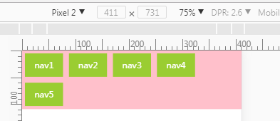
Code above will work in Apple’s product. However, when we switch to Pixel 2 we will find this:

After a little calculation, I find that the total width of 5 navs is 1078.85 while width of .nav__list is 1078. Well, I think it is reasonable though I hate this.
In this case, we have to do something else to fix this. For example:
- Set
margin-right:autoon the last nav. - Set wider
widthof.nav__listand setoverflow:hiddenon.nav. - Use
width:20%andpaddinginstead ofmargin. - Other css tricks.
Anyway, this is the previous solution for adaptation on mobile before appearance of vw,flex and grid layout.
Let’s make a conclusion:
- principle
- Set different font-size for different DPR by less.
- Use viewport scale to solve the problem of 1px on border and font-size.
- Make the width and height of element connect with device-width by
rem.
- pro
- Fix 1px problem on
borderbecause we set 1px on device*DPR.
- con
- We have to set lots of
font-sizebased on DPR every time we want to setfont-sizewith px. Though we can simplify our job by preprocessor(e.g. less). However, how we going to do with more and more DPR?
.px2px(@name, @px) { |
Write more and more? That’s not a good idea.
If we use em instead it will not be a problem because we already set the initial font-size * DPR on body.
- Decimals appear which may cause a little problem in layout.
Adaptive by vw
Before we start with vw let’s take a look at the rem and js solution. So, do we have a better solution for:
- border 1px problem? I don’t think so.
- make the width and height of element connect with device-width? Yes, we do have
vw,vhevenvminandvmax.
And for the con of the rem and js solution:
- In this case, we can use
reminstead ofembecauseremworks more likepxthanem - Can we avoid the decimals ? May be not with
vwbut won’t be worse thanrem.
Anyway, here is the code:
<head> |
base.css in less.less
/* base.css */ |
I tested every device in chrome device-mode. They all work.
However, there are still decimals which might bite you someday.
Anyway, let’s make a conclusion:
- principle
- Make the font-size connect with dpr by
rem. - Use viewport scale to solve the problem of 1px on border and font-size.
- Make the width and height of element connect with device-width by
vw.
- pro
- Border 1px problem is solved as before.
- Decimals problem will be a litter better than rem and js solution.
- con
- Decimals still exist.
Adaptive by vw and flex
Solution with vw almost perfect except the decimals. So, how we are going to fix that? Flex gave us a choice.
We can leave the decimals to browser by flex.
/*part of css which has been modified*/ |
If you don’t know something about flex, please check MDN. Anyway, we can leave decimals to browser. That is the most exciting part.
Well, let’s make a conclusion:
- principle
- Make the font-size connect with dpr by
rem. - Use viewport scale to solve the problem of 1px on border and font-size.
- Make the width and height of element connect with device-width by
vw. - Leave margin to browser by
flex.
- pro
- Border 1px problem is solved as before.
- Decimals problem will be better than
vw.
- con
- Decimals still exist but only has a little influence.
Ending
Anyway, the decimals problem always exist because of different sizes of mobiles. But the more new API we have, the less influence it will have.
Besides, js above is not perfect. Here is the current version I am using.
And the last thing is we didn’t handle the problem with img. Maybe you should seek some help from retina.js.