Preface
Recently, I have been working on mobile development. Before this I have heard something strange but I didn’t pay attention to. Now, I have to figure out though there is a lot of stuff. I am trying to make it clear as possible as I can but I am not sure content below is completely right.
Basic concepts
Css Pixels, Physical Pixels and DPR
First, let’s start with demo:
<div class="cont"> |
* { |
Before switching to device mode, make sure you don’t have code starts with <meta name="viewport" ... in your head tag.
Normally, we will find everything seems ok when we switch to mobile. For example, Let’s switch to iPhone6.
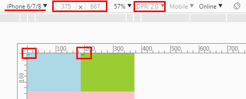
According to chrome-devtools, width 375 and height 667 is css pixels. And before we keep going , we need to figure out some terms first including css pixels, physical pixels and DPR. Here is some related readings:
After reading those stuff, I am still confused. But I can figure something out at least. Well, here is the point based on iPhone6:
width 375 and height 667 is
css pixelsDPRis 2DPR=physical pixels/css pixels. Sophysical pixelsis 750*1334
Layout Viewport and Visual Viewport
Ok, let’s keep going. If you calculate the dimensions of viewport, you will get some strange values like below:
document.documentElement.clientWidth //980 |
Maybe you thought that the value should be 375*667 or 750*1334. However, it doesn’t. The result 980*1743 is the dimensions of layout viewport. Well, before keep going we need to know something about layout viewport and visual viewport. Here is the related articles:
Based on the articles above we can be sure of something about layout viewport and visual viewport.
layout viewportis the area that the browser uses to calculate the dimensions of elements with percentual width.visual viewportis the part of the page that’s currently shown on-screen. The user may scroll to change the part of the page he sees, or zoom to change the size of thevisual viewport.Zoom doesn’t change the size of
layout viewportbutvisual viewport.The size of
visual viewport<= the size oflayout viewport.Both
layout viewportandvisual viewportare measured bycss pixels.Many mobile browsers initially show any page in fully zoomed-out mode to show the complete content of the site. Thus
layout viewportis equal to thevisual viewportat that moment.
And in this case of iPhone6, here is something we can be sure of:
layout viewportis 980*1743visual viewportis also 980*1743The mobile browser show the page in fully zoomed-out mode to show the complete content of the site.
Meta Tag
Now, we know what happened when we switch to mobile mode. Also, we know why the size of font becomes smaller in visual.
However, we would want the layout viewport to be 375*667 or 750*1334 if we want to build a adaptive website. Fortunately, we can control the size of layout viewport by tag meta. For instance,
<meta name="viewport" content="width=375,initial-scale=1,user-scalable=no"> |
You can find the doc of meta in mdn-meta and viewport in mdn-viewport_meta_tag. In the code above, we define 375px for the width of layout viewport. Here, 375px is css pixels. Also, you can prove it by:
document.documentElement.clientWidth //375 |
So, any change? Yes. The change is the font-size is bigger in visual than before. Before we change the text is too small to read.
We can keep testing by change the width in meta. For example, let’s try 750:
<meta name="viewport" content="width=750,initial-scale=1,user-scalable=no"> |
Look what we got:
This makes sense. However, if you remove user-scalable=no in the meta the browser will again enter into the fully zoomed-out mode. In that case, you will find the font-size is smaller and the whole page is showed in the screen which make the effect of initial-scale=1 disappear.
To be compatible with mobiles with different sizes we need to switch the number to device-width:
<meta name="viewport" content="width=device-width,initial-scale=1,user-scalable=no"> |
It is easy to understand, I think. Until now, it seems that we can be compatible with mobiles. Is that true?
Adaptive Layout
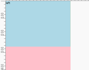
In the case above, we set width:50% for the .left and .right box. So, they could be adaptive. If we use px the page will not be adaptive because the size of viewport varies between mobiles. So, we have two choices
- Use different size according to the size of viewport
- Use percentage always
Option2 will work if our page is simple enough. In most instances, it will bring a disaster because of nested elements. One modification in parent will bring changes to all descendant elements.
The problem of option1 is if we can avoid writing so many media queries codes to adapt to different sizes of viewport. For example:
/* ... other codes for .cont with different sizes */ |
Actually, we can avoid these codes. The key is rem. For example, code above can be simplified like:
html { |
When the size of viewport is 400px, we just need to update the font-size of html with 40px. That is easy with js. Seems wonderful with rem? huh?
You can use rem everywhere and js just run one time. Here is the related lib lib-flexible.
Latest Adaptive Layout
Basically, there is no big problem with rem. Well, you might realize that we can totally use vw instead. That’s correct! The compatibility has become better for most developers to use. The same thing happen to flex and grid layout. Until 2018.6, flex is a choice but we still need to wait for grid or look for some polyfill.
However, there is still some little problems when using vw or rem layout.
- We still use
pxforfont-sizeandborder.
I think it is easy to understand because decimals would appear. In that case, we may get 15px or 17px instead of 16px. At the same time, border may disappear because of some numbers like 0.9px.
- Develop with plugins
For instance, if we are developing based on iPhone6 whose width is 375px in css pixel while the designer gives us a PSD whose width is 750px, how we are going to do? Calculate the div with 75px and transform to 10% and write 10vw? So we calculate and write it one by one? That’s terrible.
We can just write 75px and other numbers and leave the transform jobs to plugins(e.g. less,postcss.etc.).
Problems Caused by DPR
Blurry or Sharp in Different DPR Device
Until now, we haven’t talked about DPR which we mentioned in the beginning. As mdn-devicepixelratio says:
In simpler terms, this tells the browser how many of the screen’s actual pixels should be used to draw a single CSS pixel.
On the desktop or before the appearance of Retina display, DPR is always equal to 1. However, things became complicated after that. At present, there is a lot of DPR on the market which varies from 1 to 4. Sometimes, there comes 1.5 or 2.75. Anyway, we will talk about it later.
We can always get DPR by window.devicePixelRatio. The problem is that on retina screens or device whose DPR more than 1 images will become blurry. Of course we will try to avoid that. So, we have to figure out what happened to those mobiles with bigger DPR.
According to towards-retina-web,
A bitmap pixel is the smallest unit of data in a raster image (PNG, JPG, GIF, etc). Each pixel contains information on how it is to be displayed, including its position in the image’s coordinate system and its color.
Beside its raster resolution, an image on the Web has an abstract size, defined in CSS pixels. The browser squeezes or stretches the image based on its CSS height or width during the rendering process.
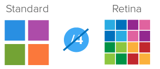
When a raster image is displayed at full size on a standard-density display, 1 bitmap pixel corresponds to 1 device pixel, resulting in a full-fidelity representation. Because a bitmap pixel can’t be further divided, it gets multiplied by four on Retina displays(assuming DPR is 2) to preserve the same physical size of the image, losing detail along the way.
For example, we got iPhone6 whose DPR is 2. And img we have is:
<img src="example.png" width="2" height="2"> |
Assume that size of example.png is 2*2 and the picture is like:

With DPR of 2, the browser has to use 2 device pixels to draw a single css pixel. So img with 2*2 css pixels will be drew by 4*4 device pixel which means example.png with 2*2 bitmap pixels will be drew by 4*4 device pixel. So, 4 bitmap pixels of example.png will be drew by 16 device pixels which means 1 bitmap pixel will be drew by 4 device pixels.
Let’s move on, normally what we want might be:

However, actual result will be:
The result happens because 1 bitmap pixel can’t be further divided into 4 device pixels. That’s what @smashingmagazine says:
A bitmap pixel is the smallest unit of data in a raster image (PNG, JPG, GIF, etc).
Because a bitmap pixel can’t be further divided, it gets multiplied by four on Retina displays(assuming DPR is 2) to preserve the same physical size of the image, losing detail along the way.
You can also find another example in mdn-devicepixelratio.
So, how can we fix this? Basically, choices we have are listed as below:
- Change the size of
img, for example:
<img src="example.png" width="1" height="1"> |
In this case, img with 1*1 css pixel will be drew by 2*2 device pixels which means example.png with 2*2 bitmap pixels will be divided by 2*2 device pixels. Hence, 1 bitmap pixel corresponds to 1 device pixel.
We might not use this alone because the layout would be affected.
- Replace example.png with 4*4 and keep the original
imgwith 2*2 css pixels, same explanation as above.
In this case, we might do this by changing the src attribute in the img. For example, update the src search param ?v=2*2 with ?v=4*4 or change from example.png to example@2x.png. retinajs will help you do this job.
Use icon-font instead of raster image.
Use svg instead.
Actually, what you need to care about is not only img but also background-image. So, option1 and option2 will be not convenient without any other help(e.g. retinajs).
Also, with DPR smaller than 2 we need to switch size back. If not, image will become sharp which is the opposite process of blur. For instance:

Compare with the process of blur:

Option3 and option4 would be easier. And with the help of iconfont, things can be easier and easier when you choose svg.
Personally, I would choose option4 in daily work. For more information about the options, click towards-retina-web.
Problems about Border
Assume that we are using iPhone6 whose DPR is 2, border with 1 css pixel will be drew with 2 device pixels. Does that matter?
Yeah, sometimes that make the border thicker in visual. When we set 1px on border, actually what we might want is to set the thinnest border that device support. Normally, on desktop browser 1px is the thinnest. So in this case, you might need to talk with designer if he wants the thinnest border(e.g. 0.5px) or still 1px.
Anyway, there is lots of ways if we want to set the thinnest border. So, I wrote another blog to talk about that. Please check border on mobile.
Ending
I have written too much about the basic knowledge about layout on mobile. However, there are still lots of problems I haven’t mentioned. Anyway, I will write them in other blogs.
Reference
what-exactly-is-device-pixel-ratio
converting-between-physical-pixels-and-css-pixels
Chinese: